
Did you know that you can create a web-site using Microsoft Publisher?
Here are some advantages to using this program to design a web-site:
- You don't need to know HTML or CSS
- The templates are free and easier to edit than Word Press or other site builder.
- It's not all that hard to use and very forgiving when you make a mistake that needs fixing.
- If you designing for a company on a small budget this could be the way to go.
Here are some disadvantages to using this program:
- It doesn't look as great as sites like Word Press. The design layout isn't always the greatest, but thank goodness you can move things around, edit the way things look, and do all kinds of other things to make it look better.
- I haven't figured out how to add a facebook or twitter button yet (a future tutorial perhaps)
- I am not sure if you can change things on the navigation bar when you hover or have visited a page.
For this exercise I created a fake business. Although I created other pages for the purpose of seeing how well the links work (which they do), I only worked on the Home Page for this exercise. I won't be getting into a lot of detail about every little thing I did. I am hoping that you are already familiar with Publisher. If you aren't, play around with it.
HERE WE GO:
Open microsoft publisher. Under File click on New. A whole list of opportunities opens up. Scroll down to "Web Sites" and click on that. In the center frame you will see a lot of templates for use. None of them look Super Duper great, but they are just templates after all. You will be changing things up as you experiment with your personal web design. For my exercise I chose "Brocade" and just created a business using that title. Click on the "Brocade" and let it load up. Take a good look at it. By the end of this writing you will see I changed some things in the template. Your first page is going to say "Home". To add other pages click on "Insert a Page" in that box to the right. A list will pop up with pre-made titles, like "About", "Contact List". Add the pages you need. Notice on my page so far I have: Home; About Us; and Product Detail. I will change that later. You can't see it here, but Publisher also adds a navigator bar at the bottom of your web page. Each page you add will have the same basic design making your job as a web designer easy.

I wanted to add another picture. What's important to know when creating web-sites is that some people have older computers and photos may not show up. As well, some people who search the web-site are blind. Their computers read information to them. Therefore it is important to do this next step with every picture you add to your site.
You need to add alternative text to your photo. The text only shows up when a photo doesn't upload properly to someone's computer or they have a computer that reads information to them. Right click on your photo, scroll to "Format Picture" and click. The Format Picture box pops up. Click on the "Web" tab. In the "Alternative Text " type a brief description of your photo. Great - This is just a great business practice in web design.

I kept the picture of the balustrade and columns, but added a frame. To do that right click on the photo. A window will pop up with a list. Click on "Format Picture". Another box will pop up. Click on the tab "Color and Lines". That's where you can make simple borders or even get a little fancier with all the free clips Microsoft has provided. Play around with it.
Change font sizes of various areas in your web site. I didn't think the font for the title was large enough so I made it bigger and changed the color too. I added another photo, moved some text boxes around, created a bullet point of fake products, created a logo using microsoft clip art and paint (its not great. Logo's are Saiful's speciality.) There are some images on the wall paper that I thought needed to be darkened. I clicked on the image I wanted to darken and a little tool bar pops up. I kept clicking the little circle that lets me know I can make things darker. Explore the little tool bar, it's a great little utility.
NAVIGATION TITLES
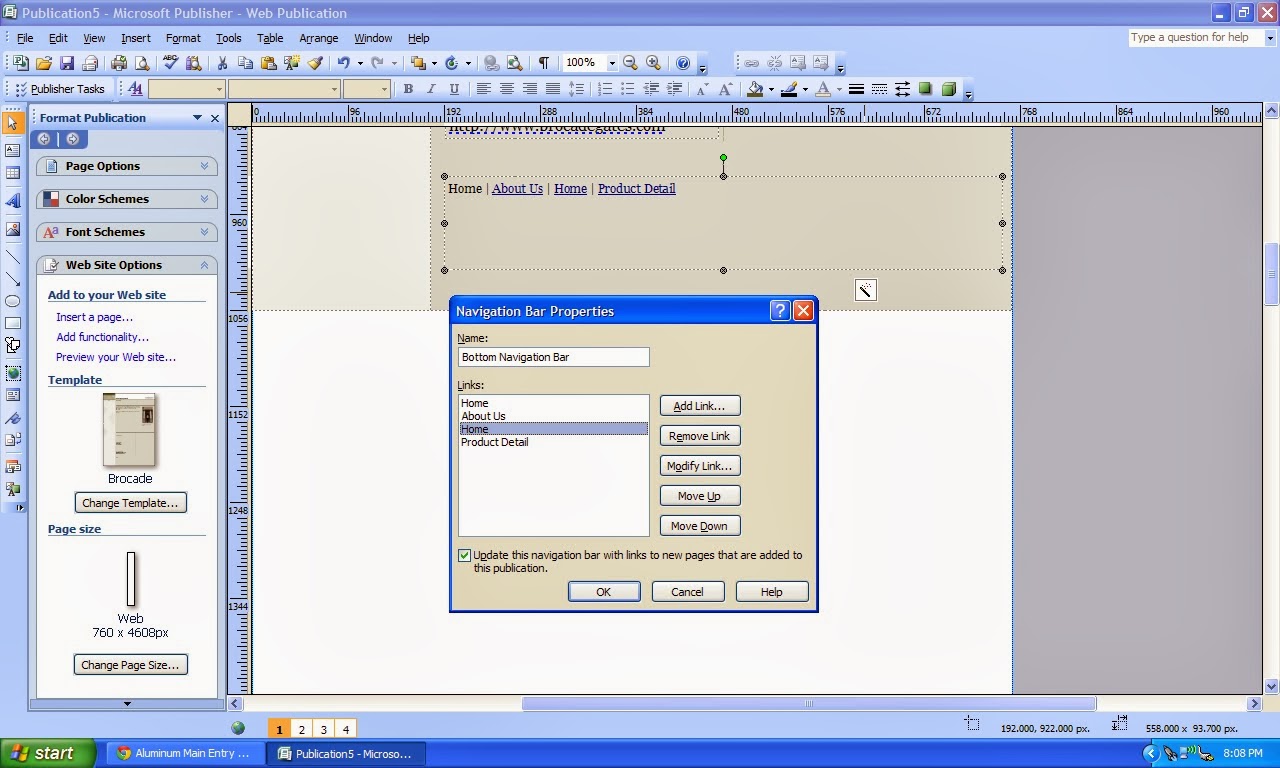
I wanted to rename a couple of navigation titles. This was easy to do in the main navigation bar. It was just like editing text in a Word Document. As I added pages I found I wanted to change the order. just click on one of the boxes in that navigation bar. A little box with a magic wand will appear. Click on that little box and you will find that this is where you can change the order of your navigation, delete pages, add links, and more. This little wand became even more important as I tried to make the bottom navigation bar match the side navigation bar. With the bottom navigation (should you decide to keep it) I had to click on the whole navigation box, the magic wand, the "modify link" box. In the text box you can change the wording of that particular button. Simple really.
To see what your web-site is going to look like on line go to "File". Scroll down to "Web Preview". When you click on that you will see a preview of the work you've done. Here's a little snapshot of my home page. You can't see everything, but you get the idea. You can see how I changed things up and it's looking a lot better than the original template.

So. Have fun designing a web-site with all the free stuff Microsoft provides for you to use. If there's a way to share with the rest of us, leave us a note with a link to what you've created.
Thanks for joining us. Have a blessed life.


